Streamlining the Verizon soft credit check
RESPONSIVE SITE
Removing doubt at a critical decision point.
A clearer, more transparent cost-to-switch experience helped Verizon reduce support calls by 33% and significantly increase trade-ins, accessory purchases, and mobile line transfers—driving growth while building customer trust.
Switching mobile providers can be nerve-wracking, especially when it involves credit checks. Many users didn’t fully understand what a soft credit check was—or whether it would affect their credit score—leading to hesitation or abandonment.
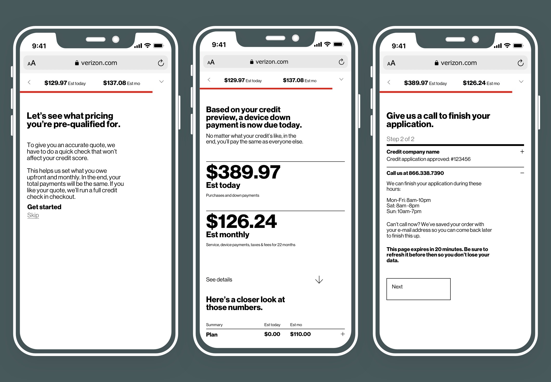
To ease the transition, Verizon introduced a credit check and checkout simulator used both in-store and online. Customers could understand total costs upfront, while store reps had a consistent tool to guide conversations and conversions.
Working with R/GA New York, I led the design of the credit and checkout experience—focusing on transparency, simplicity, and real-time flexibility. The final product used elegant microinteractions to communicate complex financial scenarios clearly and intuitively.
KEY SKILLSResearch, personas, information architecture, User flows, Site map, sketches, wireframes, testing storyboards, digital prototype.
Outcome
Trust earned, conversions unlocked.
The redesigned flow launched five months later with strong internal support and seamless implementation by Verizon's technical team. Within the first 3–4 months of launching:
The results:
Decrease in support calls the first 3 months of launch.
Rise in transferred lines the first 4 months of the launch.
Jump in phone trade-in transactions.
Uplift in accessories processed transactions.
By streamlining a critical conversion moment, the experience helped reduce churn, accelerate customer acquisition, and strengthen in-store and digital sales performance.
1. Discovery
We researched how to switch to the competitor’s network as well as the related costs. Our test was done on T-mobile, Sprint, AT&T, Metro PCS and Boost.
Some competitors use tongue-and-cheek tonality to engage customers, others have no credit check plans.
None of the competitors had a service providing a quote to the customer interested in switching over. Verizon was the only one to offer this simulator.
During our test, we analyzed and compared the features and services provided by Verizon and its competitors. This helped us refine and confirm our list to deliver.
Below is an example of the analysis we have performed.
Features |
 |
 |
 |
 |
|
|---|---|---|---|---|---|
| 1 | Plan |

|

|

|

|
| 2 | Phones |

|

|

|

|
| 3 | Soft credit check no impact on credit |

|

|

|

|
| 4 | Bringing phone number over |

|

|

|

|
| 5 | Bring your own device |

|

|

|

|
| 6 | Prepaid |

|

|

|

|
| 7 | Quote |

|

|

|

|
| 8 | Save information |

|

|

|

|
| 9 | Filter by credit rate (good/ average / no credit check) |

|

|

|

|
| 10 | No credit check plan |

|

|

|

|
Partnered with the research team, we wanted to find out a few key points, for example:
- How was research done prior to switching?
- What platform was used to complete the switch?
- The customer’s understanding of credit check.
- Do customers know their credit score?
- Is it difficult to run?
Key findings
- Interviewees perform mainly online research and comparison.
- The completion is split between online and in-store to get a “better deal“.
- Interviewees have had a credit check performed at least twice but haven’t necessarily run the process themselves.
- Interviewees rarely know their credit scores.
Studying the research results helped us to refine our understanding of the users and their goals:
- Jim likes to keep an eye on the cost.
- while Megan wants an overall upgrade for the family.
- Jake likes the latest and greatest gadgets.
 Jim, 45
Married, has a freshman in college, a teenager and a pre-teen
Finance Director
High income, good credit
"I want to swap to keep contact with Brian now in college."
Needs
Making sure to have enough gigs for the family.
Bring my own device - BYOD.
Being able to trade-in our old phones.
Change phone number.
Pain points
Confusing process for BYOD.
Hate seeing too many plan sizes.
Being able to pick the new phone numbers.
 Megan, 40
Married, has a teenager and a pre-teen
VP of Marketing
High income, very good credit
"It's time for a change and an upgrade."
Needs
Being able to get offers.
Having a good panel of plans.
Bring phone numbers over.
Having a Free shipping option.
Pain points
Don’t want to send contacts new number.
Can’t save research for a later consultation.
Unsure when the price shown includes taxes.
 Jake, 28
Single, no kids
Video editor
Medium income, average credit
"I like to get the latest gadgets as soon as possible."
Needs
Having enough gigs for streaming.
Having access to the latest phones.
Being able to trade-in old phone.
Pick-up available close to work.
Pain points
Having to wait for delivery.
Not having the latest phones available.
Having shipping options.
User flow
The tasks to perform credit checks were easy to identify. The placement of the credit check in the simulator flow was the challenge. We explored multiple scenarios until it felt natural without removing the seriousness of the task.
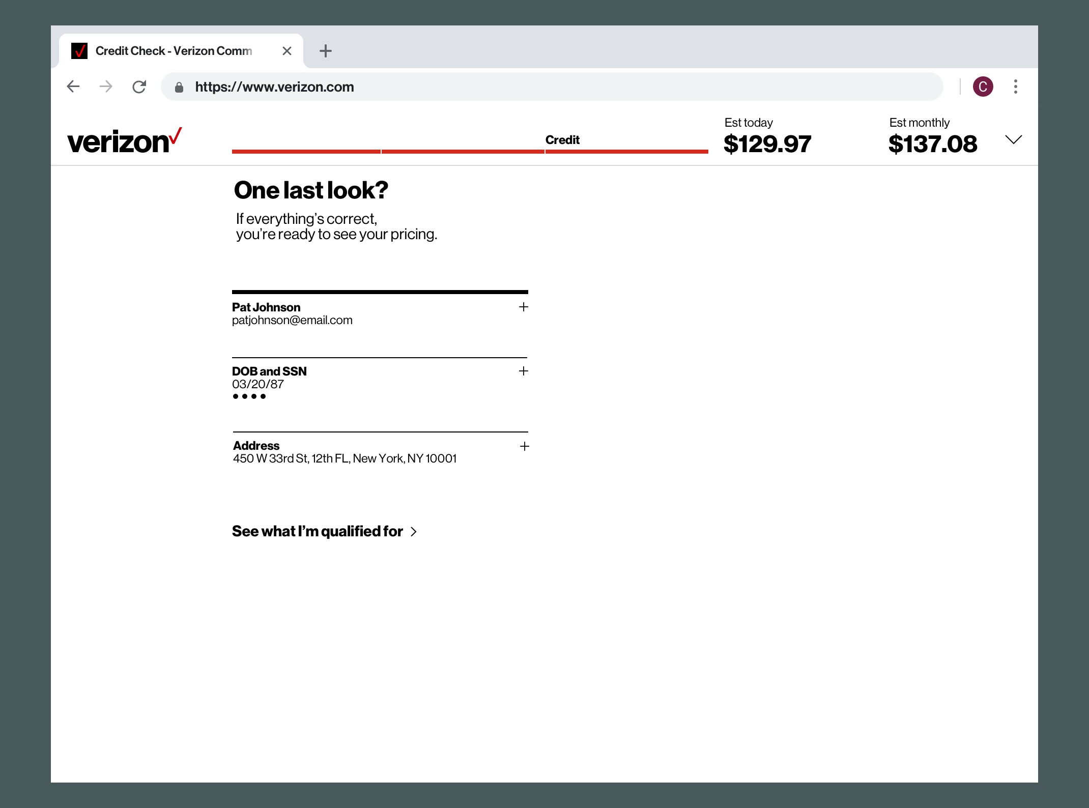
Here is an example of a user performing a soft credit.
Site map
The simulator tool solution was to be embedded in the original structure. Drawing the existing hierarchy and adding the new elements without intrusion was the natural approach.
2. Ideation & Design
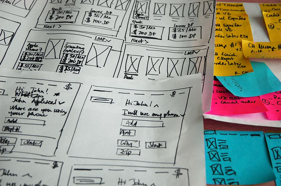
We had a quick sprint of 2 weeks to deliver the feature set given to us. We captured the list of requirements on a corner of a whiteboard, then sketched and iterated 5 or 6 times a day depending on the feature.
3. User Testing
We put a polished version of our design into a digital prototype to challenge our decisions.
We asked users to run a credit check and focused on finding answers on:
- The element placements and information hierarchy.
- The tone of voice.
- The iconography.
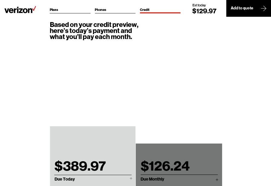

Key findings
- The CTA placement was creating confusion for users.
- The progress bar indicated where the user was, but not how close the user was to completion.
- The copy didn't provide enough explanation related to the results.
- The graph was too minimalist and users couldn't find how to view the cost breakdown.
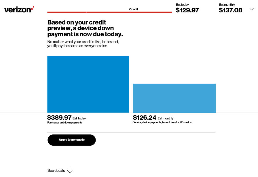

Key findings
- Amending the CTA shape brought some softness to the page.
- Adding the estimated figures was necessary to bring more cohesion to the page and a comparative element.
- The copy provided a better information on the cost, but still had the small print feeling.
- Showing the elements that composed the updated costs due today and monthly brought more transparency.
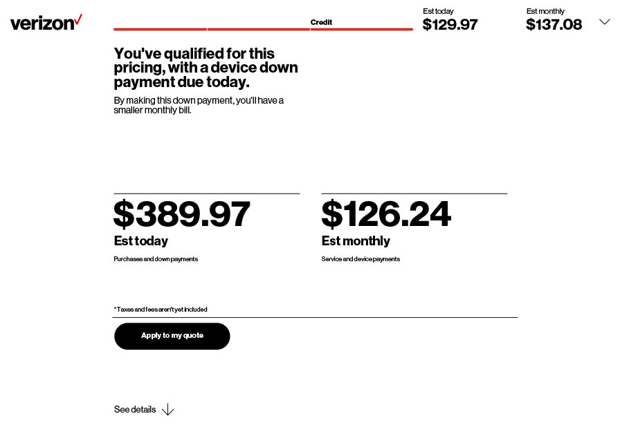

Design amends
Relocating the CTA to eye level reduced cognitive load for the users.
Breaking down the progress bar into segments gave a better sense of the process completion.
Changing the tone of voice gave more positive feedback and clarity on the impact of the action taken.
Removing the graph made it easier for users to understand the variance in costs.
Solution
Confidence built. Switching simplified.
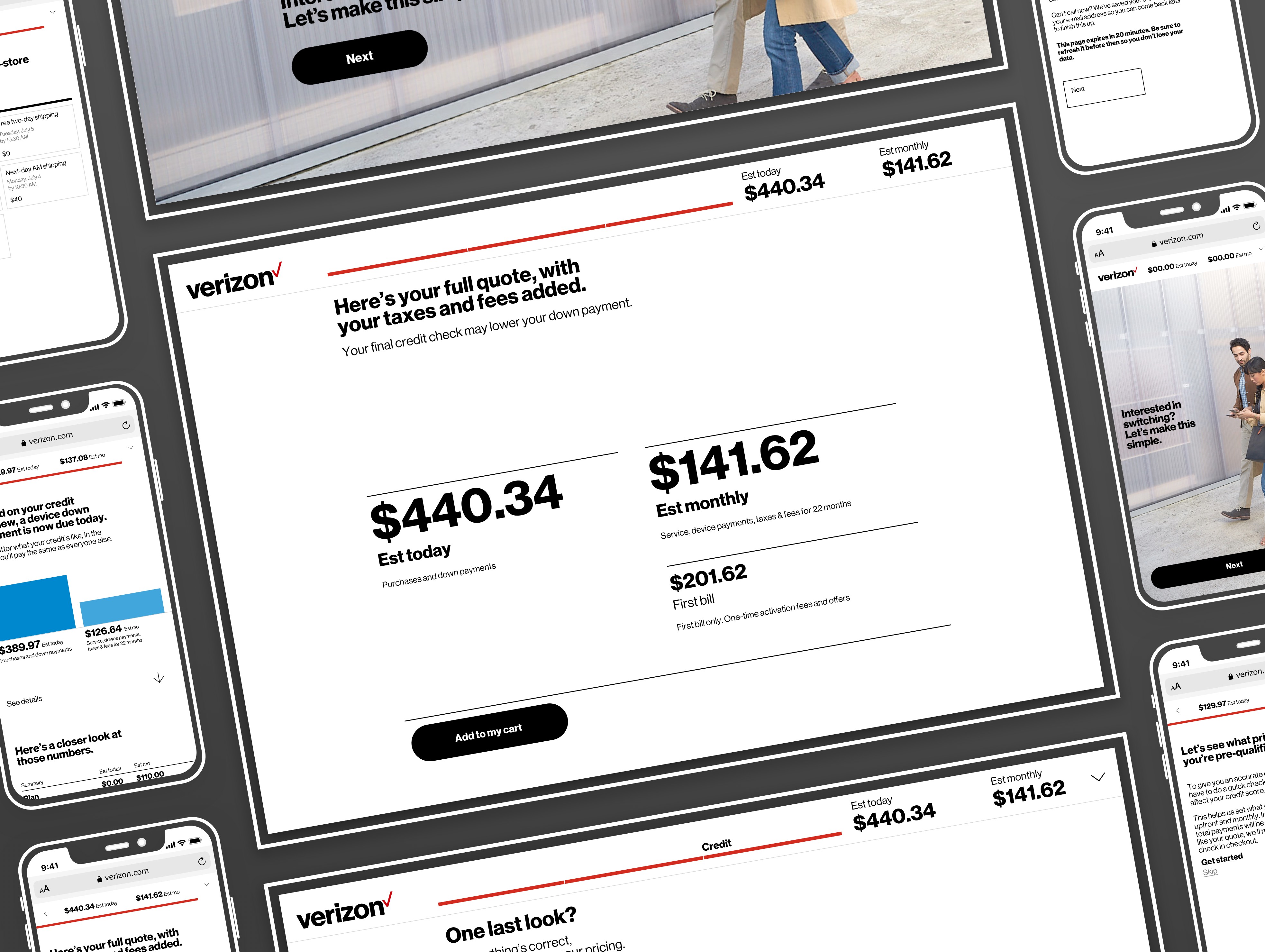
To reduce friction during a sensitive decision point, we redesigned the credit check and checkout experience to give users full visibility into the cost of switching—and to demystify what a soft credit check actually is.
The new flow gave customers clarity, control, and confidence—simplifying trade-ins, building trust through transparent pricing, and driving more line transfers with fewer support escalations. Designed for use both online and in-store, the experience worked seamlessly across channels.
