Design System-Text Area
CROSS-PLATFORM
"Text Area" is used for long form text input and typically appears in forms. The field allows users to enter text that is longer than a single line.
There was no unified field for Text Area that is used across product experiences. As a result, each team maintained their own logic and design by product and platform, creating a disjointed experience across the ecosystem.
The goal was to create a single source of truth and ensure parity across all platforms and experiences.
As the sole designer on this effort, I audited the characteristics and usage of Text Area across Verizon and its competitors. Taking those insights and considerations I created a rationale, leveraged existing UX standards and principles when possible, advised on guidelines for product teams and produced a specification for the tech team.
SKILLSResearch, Defining product requirements, Component design, Component guideline, Specification documentation
1. Discovery
 Internal audit
My research started with understanding the meaning of a component in our ecosystem, and its usage by the product teams at Verizon. Capturing examples helped to understand the functionality and characteristics. Organizing and categorizing them by similarities brought to life the discrepancies.
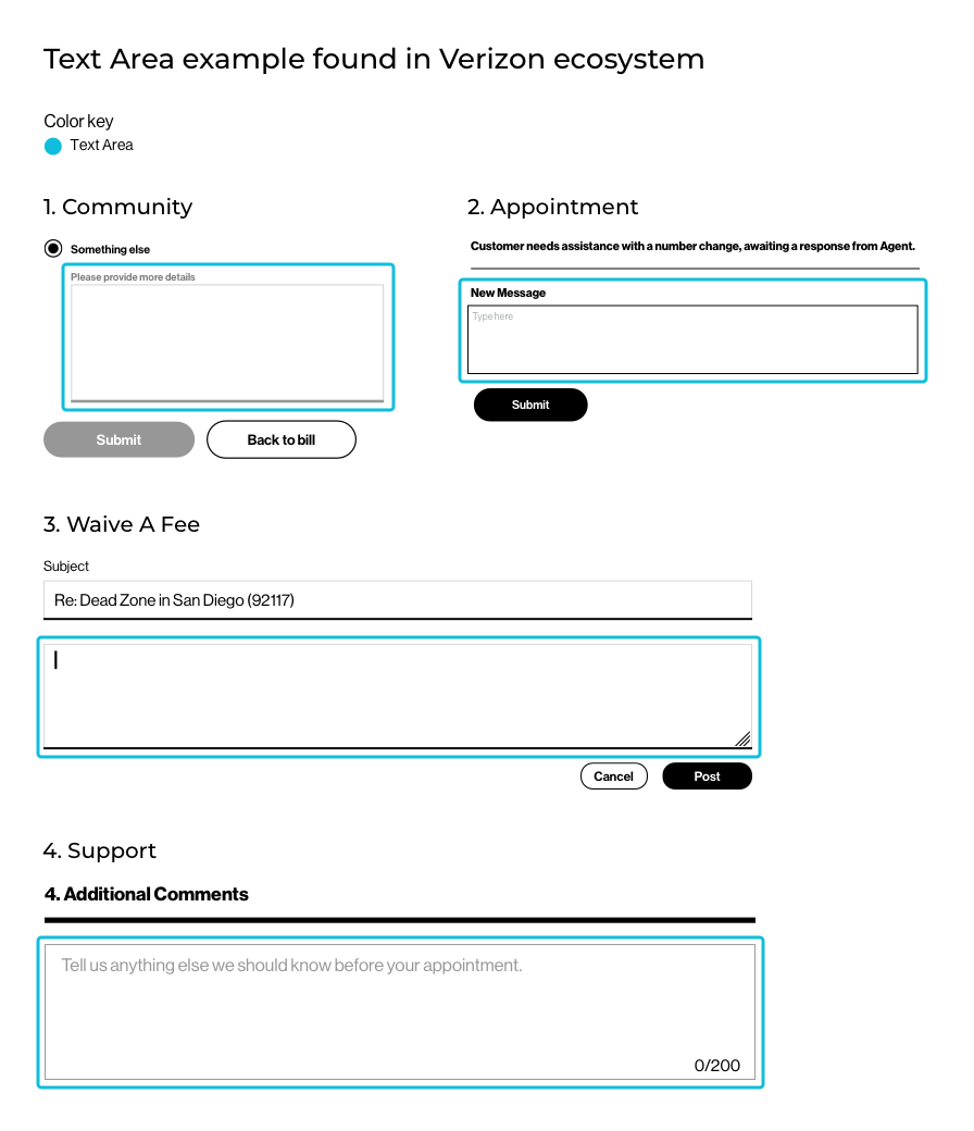
Similarities
- Container
- Input text
- Placeholder text (optional)
- Helper text (optional)
- Error text
- Character counter (optional)
Discrepancies
- Label type / style
- Label marker (optional)
- Placeholder text style
- Container color
- Container height
- Container width
- Container vertical scaling
- Bottom line
- States
- Error marker
- Behavior
- Look and feel (font style / color)
 Competitive Analysis
Looking across other design systems helped to understand the need and function that Text Area was fulfilling in other organizations. There were four topics of interest: Its attributes, composition and two behaviors:
- The container vertical scaling as content is entered.
- The mechanism of the character counter within or exceeding a character limit.
Container scaling |
Material Design | Carbon | REI - Cedar | Shopify - Polaris | |
|---|---|---|---|---|---|
| 1 | Auto-resize | Material Design | Carbon | REI - Cedar | Shopify - Polaris |
| 2 | Scroll Bar | Material Design | Carbon | REI - Cedar | Shopify - Polaris |
| 3 | Preset height | Material Design | Carbon | REI - Cedar | Shopify - Polaris |
| 4 | Draggable-vertical | Material Design | Carbon | REI - Cedar | Shopify - Polaris |
| 5 | Draggable-horizontal | Material Design | Carbon | REI - Cedar | Shopify - Polaris |
To solidify the Text Area attribute list, a cross-examination between internal and external findings was performed. This helped to create the list of common attributes versus the distinctive ones. The latter varies based on the business and customer needs.
Commonalities
- Label type / style
- Label marker (optional)
- Placeholder text (optional)
- Container style
- Bottom line
- Input text
- Error text
- Helper text (optional)
- Character counter (optional)
- States
Distinctives
- Label position
- Container vertical scaling
- Container height
- Container width
- Character counter position
- Bottom line
- Error states
- Marker for error (optional)
- Behavior
- Look & feel (font style / color)
 Attributes mapping to an existing component
To create a sustainable solution, I searched the library for an existing component which was similar in composition to Text Area, and shared the most attributes that could be repurposed.
The mapping validated the assumption I had to leverage the elements and behavior of Input Field.
 Product requirements
Working in partnership with the product owner to define the product requirements, I created component profiles for Input Field and Text Area to establish shared attributes or behavior versus new ones. Some states that were not fulfilling a business case were excluded.
Attributes shared between Input Field and Text Area |
Input Field | Text Area | |
|---|---|---|---|
| 1 | Label type | Input Field | Text Area |
| 2 | Label marker | Input Field | Text Area |
| 3 | Container style | Input Field | Text Area |
| 4 | Container minimum width | Input Field | Text Area |
| 5 | Bottom line | Input Field | Text Area |
| 6 | Helper text optional | Input Field | Text Area |
| 7 | Error marker | Input Field | Text Area |
| 8 | States (Default, Hover, Active, Keyfocus, Disabled, Read-Only) | Input Field | Text Area |
| 9 | No label type | Input Field | Text Area |
| 10 | Container height minimum | Input Field | Text Area |
| 11 | Character Counter | Input Field | Text Area |
Behaviors shared between Input Field and Text Area |
Input Field | Text Area | |
|---|---|---|---|
| 1 | Label Overflow | Input Field | Text Area |
| 2 | Helper text overflow | Input Field | Text Area |
| 3 | Platform responsive | Input Field | Text Area |
| 4 | Character counter mechanism | Input Field | Text Area |
| 5 | Character counter overflow | Input Field | Text Area |
| 6 | Character counter error state | Input Field | Text Area |
| 7 | Character counter overflow error state | Input Field | Text Area |
| 8 | Helper text & error text overflow | Input Field | Text Area |
| 9 | Container vertical scaling | Input Field | Text Area |
2. Design explorations
Design explorations started with solving for the distinctive Text Area attributes and behaviors:
- The container preset height.
- The container vertical scaling.
- The character counter mechanism.
 Distinctive attributes
Container
Text Area container has two aspects that differentiates it from Input Field:
- The container preset height.
- Its behavior when multiple lines of content is entered.
1. Height
A container height indicates to the customer the amount of content that can be entered. It needed to fulfill these characteristics:
- Maintain the look and feel of its parent.
- Have a visual distinction between Text Area and Input Field.
- Holds multiple lines of content.
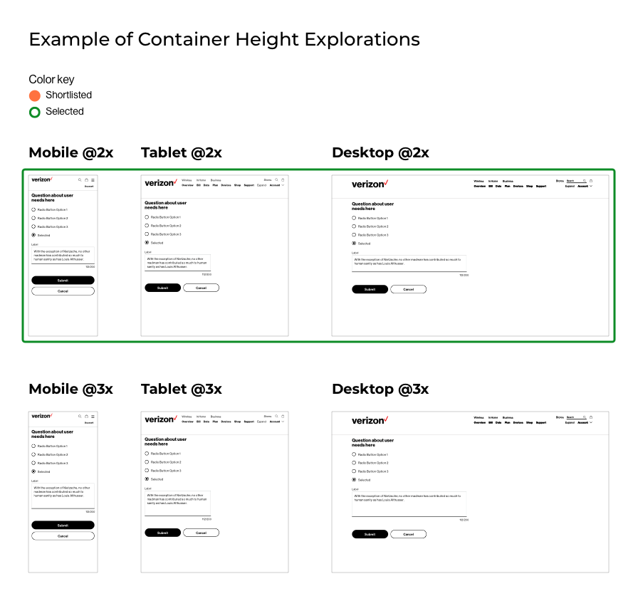
A mixture of heights were observed across the ecosystem. The Input Field height was used as a baseline, and I explored multiplers of it across breakpoints to determine the appropriate height preset.
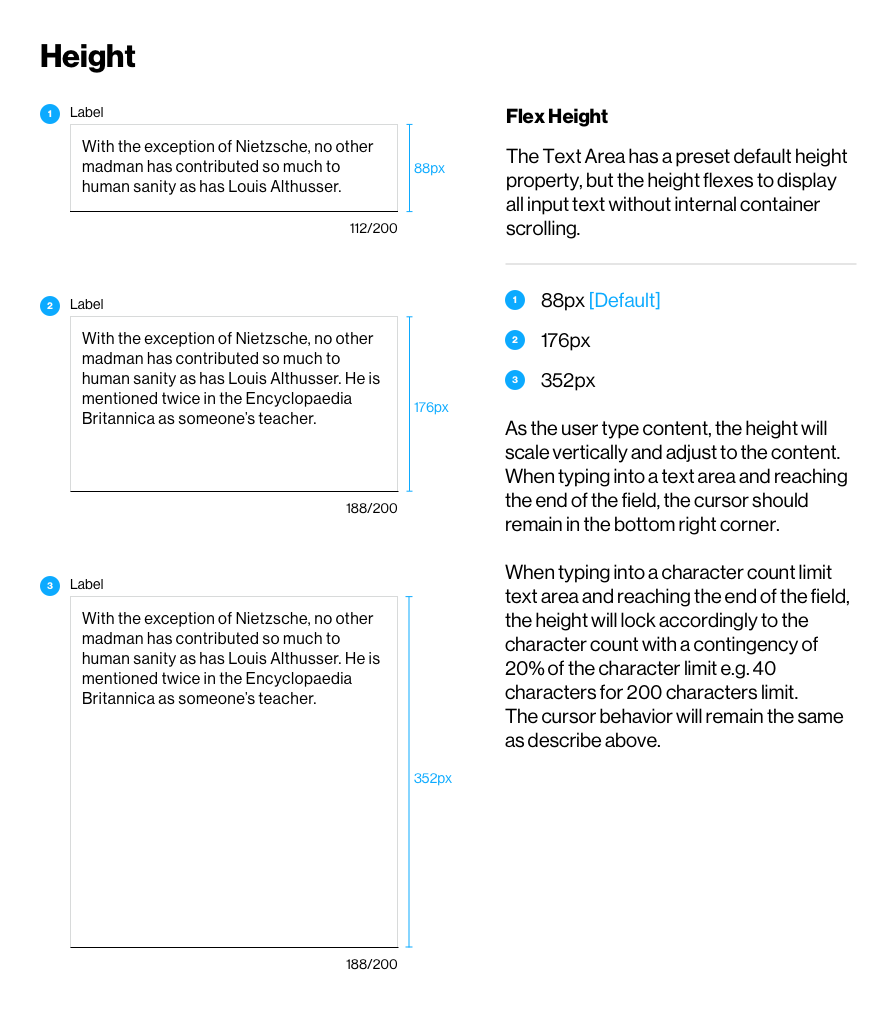
After multiple iterations based on the feedback received from the design team, I recommended three height presets at 2x, 4x and 8x. This would be more contextual for the Verizon product experience and provide visual cues on the amount of content to enter.
2. Vertical scaling
A container can adapt when multiple lines of the content is entered. The behavior needed to fulfill these characteristics:
- Container scales to the content.
- Minimal intrusion and interruption when writing.
- Minimal interaction from the customer to view the content entered.
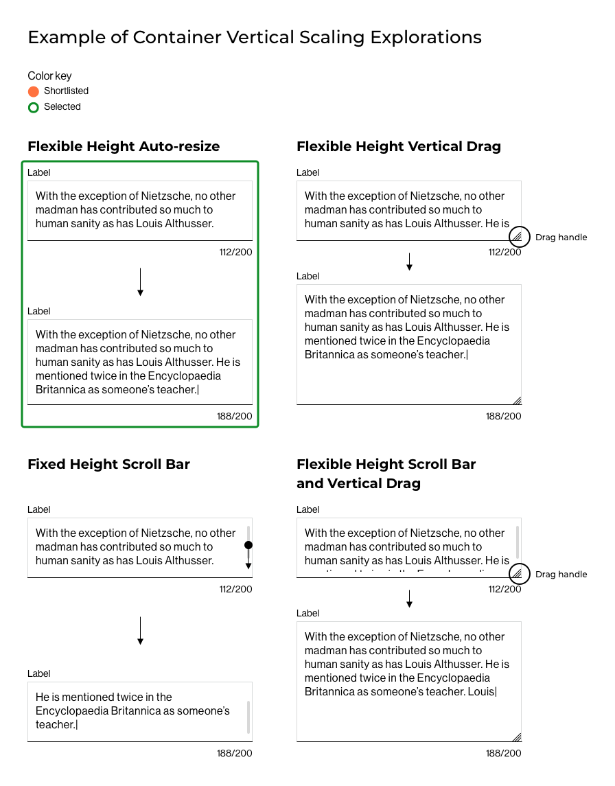
Research revealed that Text area container scaling to the content was dependent on its container height flexibility. A container height can be flexible or fixed.
When flexible, it adapts to the content entered to display its entirety to the customer or a portion of it. Fixed, it will only display a portion of it.
When a portion of the content is displayed, a user control is integrated allowing customers to view the remaining of it.
The control would either be internal to the container (scroll bar), external (drag handle) or have both.
Flexible height had two common behaviors:
- Auto-resize shows a full view of the content. Yet, the container behavior can be designed with a scroll bar when reaching a threshold.
- A scroll bar or a drag handle shows a partial view of the content, giving control to the user to view more on command.
Fixed height only had one behavior:
- A partial view of the content paired with a scroll bar.
A mixture of flexible with drag handle and fixed height were found internally. The goal was to remove any friction distracting customers from their primary focus: writing.
After multiple combinations, I recommended a flexible container auto-resizing with no control, this would display the full content, minimize interruption and allowing customers to focus on their writing.
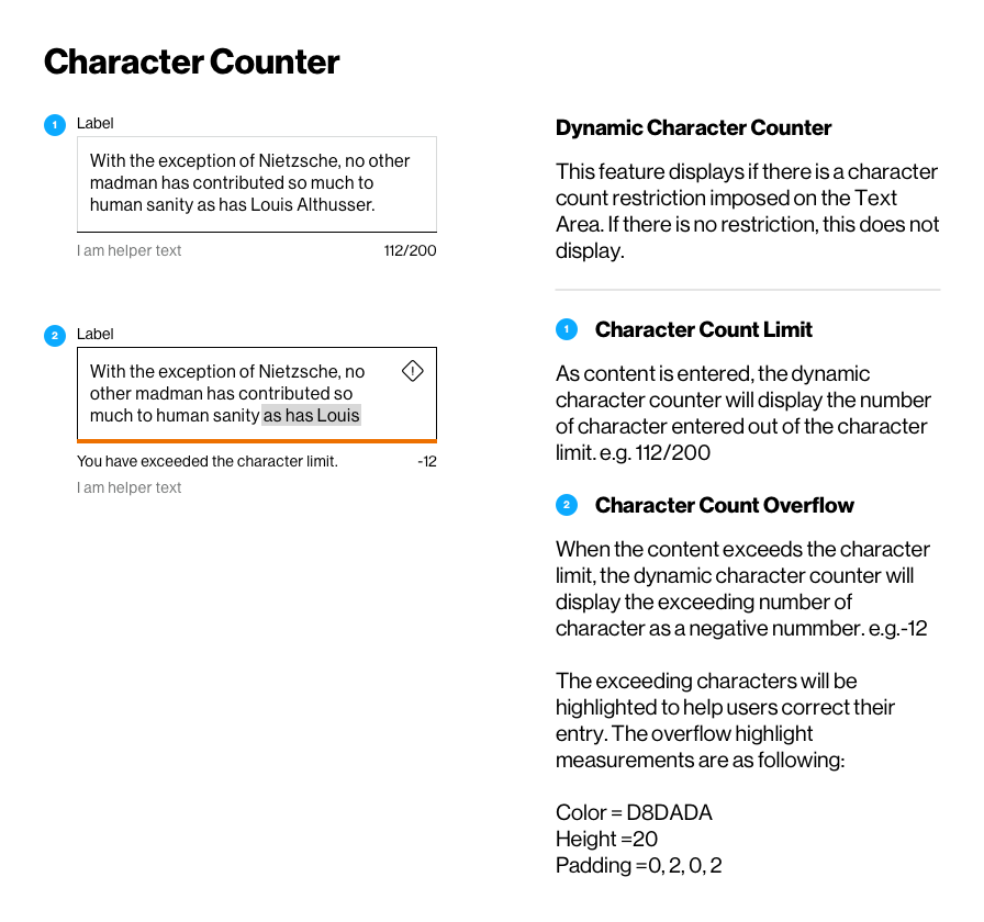
Character counter
A character counter helps users know how much text they can enter when there is a limit on the number of characters. The feature is optional for Text Area and is another differentiator to an Input Field. The design solution needed to fulfill 4 aspects:
- The character counter position.
- The counter type (numerical or alphanumerical).
- The color.
- The mechanism.
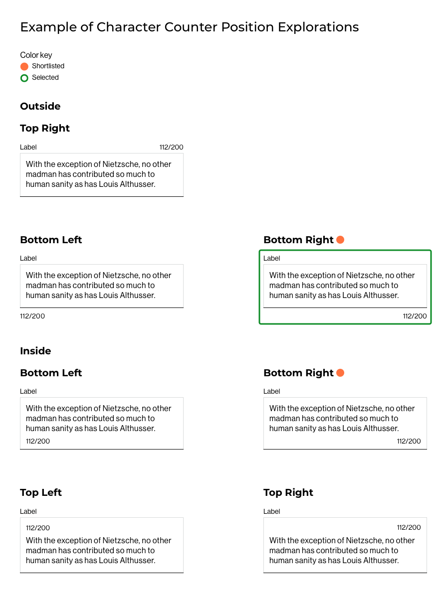
1. Counter position
Informative and providing real-time feedback to customers, its position was crucial and needed to fulfill these characteristics:
- Legible.
- Visible.
- May shared real estate with other attributes such as the Field Label or Helper Text.
The team came to a consensus that the two preferred explorations were inside and outside the container on the bottom right.
My recommendation was to have the counter outside the container on the bottom right, as the location was not too predominant or intrusive.
It provided better legibility on smaller platforms, was less distracting when writing and wouldn’t require Verizon customers to learn a new behavior already experienced across products.
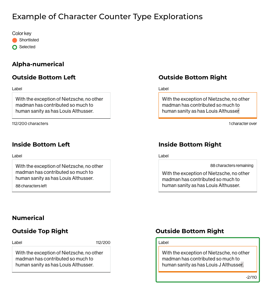
2. Counter type
A counter calculates and displays the number of characters or words written. The aspects to keep in mind for this solve were:
- A small learning curve.
- Being mindful of the real estate on mobile.
Using a numerical counter would be optimum on mobile but alphanumerical would be less ambiguious in the scenario of an exceeding character limit which takes more real estate.
After a few rounds of explorations, I created a numerical character counter.
It would take less real estate on mobile, and wouldn’t require Verizon customers to learn a new behavior already used on the site.
The addition of supporting content on character overflow would help mitigate user frustration in exceeding the character limit.
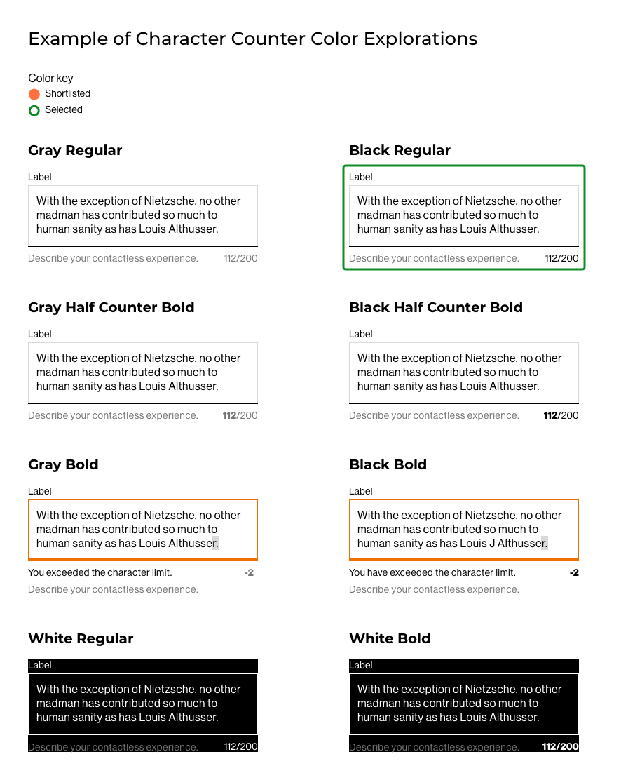
3. Color
The counter color and its position had similar considerations to account for:
- Legibility.
- Visibility.
- Shared real estate with other attributes.
- Follow or pair with the Input Field color scheme.
Input field color scheme used Black, Gray, Orange and White. I leveraged the parent color palette and explored with both color and type weight to bring contrast.
Gray was less instrusive, but it could be lost next to the Helper Text, already a shade of gray.
Type weight impacted legibility and could be distracting when writing.
My recommendation was to use Black Regular weight. It was more predominant but provided more contrast and paired well with Helper Text.
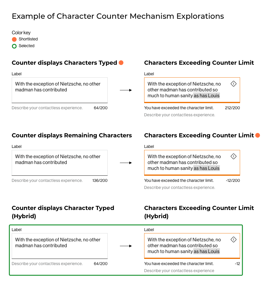
4. Mechanism
A character counter needs to convey the number of character entered and have a small learning curve. Its behavior had two scenarios to care for:
- When the character count is within the character limit.
- When it exceeds the limit.
Across the examples seen, there were two ways to display the information:
One way to convey the counted characters was to display the number of characters as they are typed, out off the character limit.
When exceeding the limit, the counter would display the number of character as a positive number. e.g. 64/200 and 212/200
Another would be to display the remaining characters that can be typed, out off the character limit.
This time, when exceeding the limit, the counter would display the number of character as a negative number. e.g. 136/200 and -12/200
My recommendation was the first option. The final direction was a hybrid version.
Within the character limit, the counted characters would display the number of characters as they are typed, out off the character limit. e.g. 64/200.
Exceeding the limit, the counter would only display the exceeding number of characters as a negative number. e.g.-12
Adding supporting error text next to the counter helped lift any ambiguity.
The brief was fullfilled but missing addressing the frustration of having to count characters to remove when exceeding the limit. By adding a visual aid highlighting in gray the deliquent characters, customers would correct their mistake easily.
Technical reviews: For new behavior such as the character count mechanism, our process requires design to validate solutions with Tech during explorations on a feasibility standpoints.
During this project, I worked closely with my tech counterpart and met often to validate my rationale and solutions prior to presenting my design recommendations to the design team for feedback.
 Shared attributes
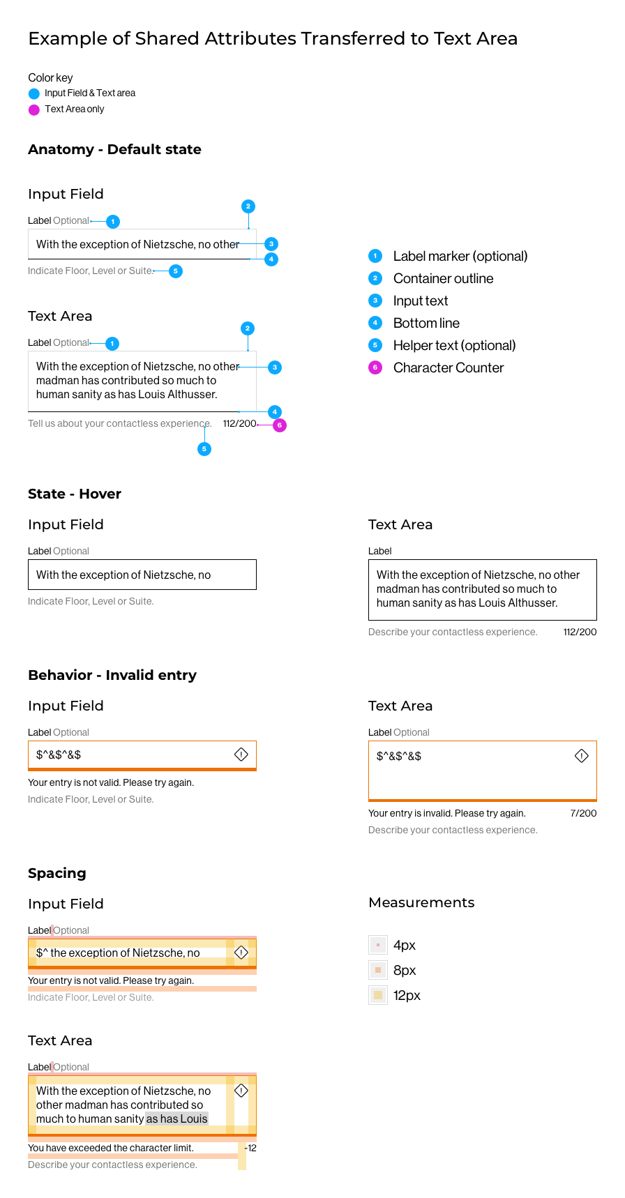
To complete the Text Area component set, I transferred the Input Field attributes styling and behaviors to Text Area.
The design explorations addressed:
- The anatomy.
- The states.
- The behaviors.
- The spacing.
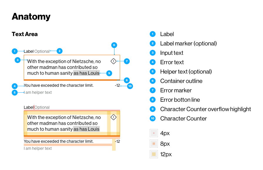
 Specification documentation
The specification document is written for the tech team to refer to when building the React component.
Our documentation has seven core sections across all specifications and covers:
- Anatomy.
- Optional elements.
- Height.
- Width.
- States.
- Spacing.
- Behavior.
A section was added for character counter to capture its distinctive attributes and behavior.
An excerpt of the spec I wrote for Text Area and presented at hand-off to the Tech team can be seen below.
Solution
Outcome
The logic and interaction for Text Areas have been adopted and embedded in the Verizon Design System in the March 2021 release.
It created cohesion and meaning for the use of Text Area, and allowed for the intelligent organization and chunking of information.
Next steps are to evaluate the translation of Text Area for native app, and to understand whether Text Area as a component translates across platforms, or if there are necessary changes to ensure parity.
Increase in design delivery velocity to tech teams.
Increase in tech velocity to production.
Decrease in support questions to the Design System Team.
Decrease Visual Quality Assurance time.