Verizon - App
MOBILE APP
The competition is fierce in the wireless market.
Bringing innovation is challenging; Verizon wanted to bring a new contender. The entire process would be done online: from opening an account, keeping an eye on the cost or using rewards.
Our agency, R/GA New York, partnered with Verizon to design the next generation of the Verizon phone plan. It took a team of 100 people split in 5 teams across different disciplines.
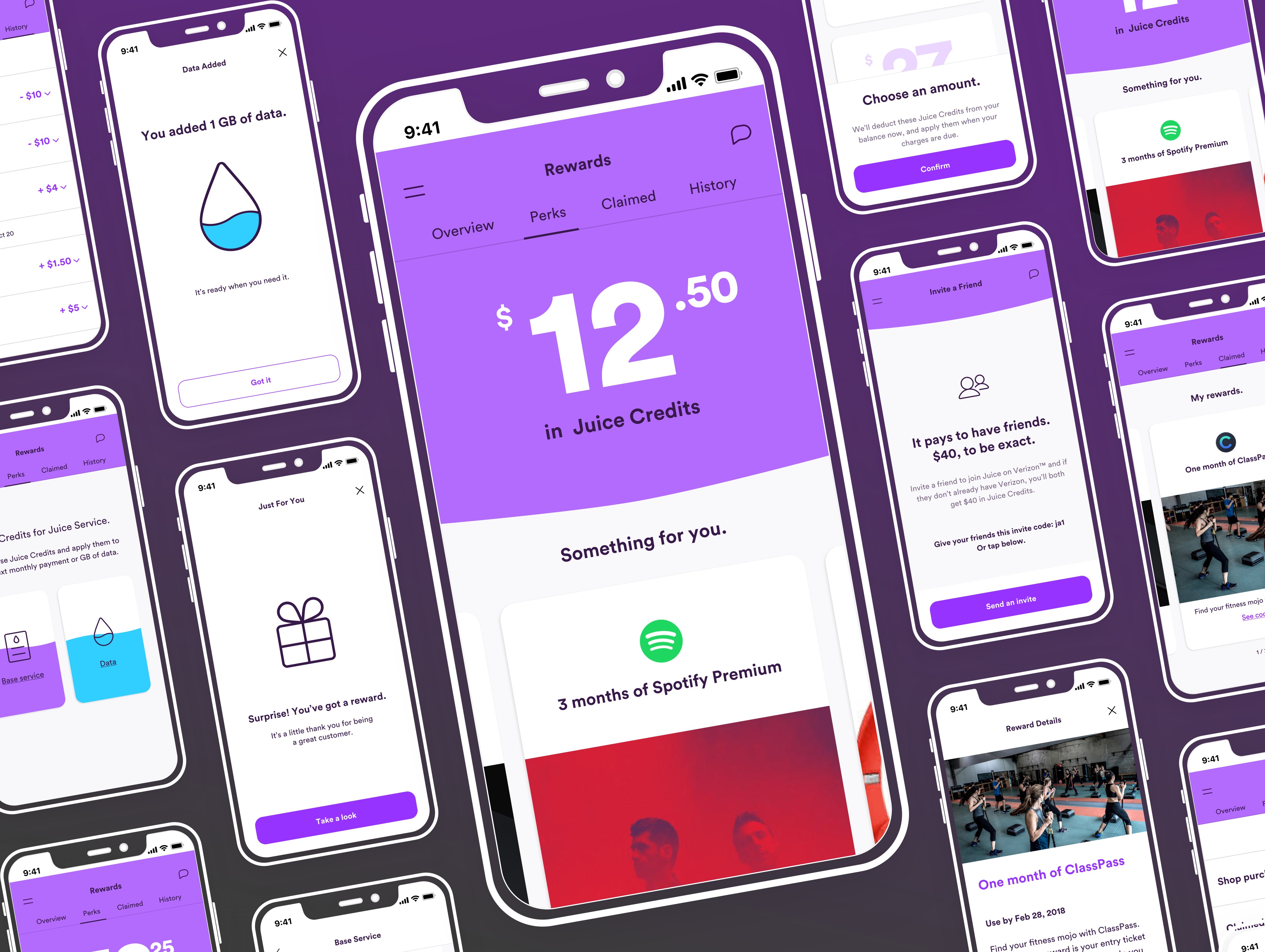
My team was commissioned to design the Rewards experience on the app. This element is the main driver for customer engagement and retention. The app has a conversational tone of voice, and is playful yet cost-transparent.
SKILLSResearch, personas, information architecture, user flows, sketches, wireframes, testing storyboards.
1. Discovery
We covered our bases and learned the nuances of phone plans:
- Prepaid with data.
- Prepaid without data.
- Plain old pay-as-you-go.
We reviewed Ting, Giffgaff, Cricket wireless, Boost or Republic wireless. In many cases, the apps (if existing) allowed the customer to browse for a new phone, look at the details of their spendings and set spending caps.
Juice is unique for its Rewards. Then we deep-dived in the world of Rewards: Travel, hotels and stores to learn best practices in Alaska Airlines, Delta Airlines, IHG rewards club, Marriott rewards, Starbucks, CVS or Macy's.
Being part of the team to deliver the Rewards experience, we focused on the ins-and-outs of Rewards mechanisms, its features and services. This helped us build the right solution for the app.
Features |
|||||
|---|---|---|---|---|---|
| 1 | View balance |
|
|
|
|
| 2 | Browse non-brand rewards / offers |
|
|
|
|
| 3 | Redeem non-brand rewards / offers |
|
|
|
|
| 4 | Account activity |
|
|
|
|
| 5 | Personalized offers |
|
|
|
|
| 6 | Pay with points / credits |
|
|
|
|
| 7 | Refer a friend credits |
|
|
|
|
| 8 | Add to Apple wallet |
|
|
|
|
| 9 | Surprise / Birthday offers |
|
|
|
|
| 10 | Tier status |
|
|
|
|
| 11 | Points expiration |
|
|
|
|
Research provided insights on customer’s habits by age bracket and the business strategy decision was to appeal to customers about to or who have recently left the family plan or for young families.
We looked for answers on:
- The type of rewards program people are part of.
- Their understanding of how to use rewards.
- Their usage preference.
- In-store or online usage and their favorite freebies.
Key findings
- Interviewees are mainly part of a rewards program through a store less so from a utility provider.
- Interviewees expressed that they want to view and redeem offers easily on their phones.
- Interviewees said that they found more convenient to use rewards online.
- Interviewees like to receive exclusive or personal freebies.
We created 2 representative users based on the research findings:
- Chris who likes to make the most of his phone.
- Angela who prefers to only pay for what she uses.
 Chris, 25
Single, no kids
Fashion designer
"I want to be connected with my friends but can’t afford an unlimited plan yet."
Needs
Getting the most gigs for my buck.
Bring my own device - BYOD.
Being able to trade-in my old phone.
Getting nice freebies.
Pain points
Confusing process for BYOD.
Hate reading small print about plans.
Being able to pick a new phone number.
Chris, 25
Single, no kids
Fashion designer
"I want to be connected with my friends but can’t afford an unlimited plan yet."
Needs
Getting the most gigs for my buck.
Bring my own device - BYOD.
Being able to trade-in my old phone.
Getting nice freebies.
Pain points
Confusing process for BYOD.
Hate reading small print about plans.
Being able to pick a new phone number.
 Angela, 32
Married, has a pre-teen and an 8-year-old
Store manager
"I want to pay for data only when we need it, we are on wifi all the time."
Needs
Getting frequent offers.
Only pay for what we use.
Bring phone numbers over.
Having a Free shipping option.
Pain points
Having to reach out to friends when changing number.
Can’t really see what we use the data for.
Having to monitor the data usage regularly.
Angela, 32
Married, has a pre-teen and an 8-year-old
Store manager
"I want to pay for data only when we need it, we are on wifi all the time."
Needs
Getting frequent offers.
Only pay for what we use.
Bring phone numbers over.
Having a Free shipping option.
Pain points
Having to reach out to friends when changing number.
Can’t really see what we use the data for.
Having to monitor the data usage regularly.
We performed rounds of card sorting, which helped to create the information structure and hierarchy of Rewards.
Starting with the idea path a user takes on the platform to complete the desired task helped us to embed the unhappy path in a more seamless manner.
User flow
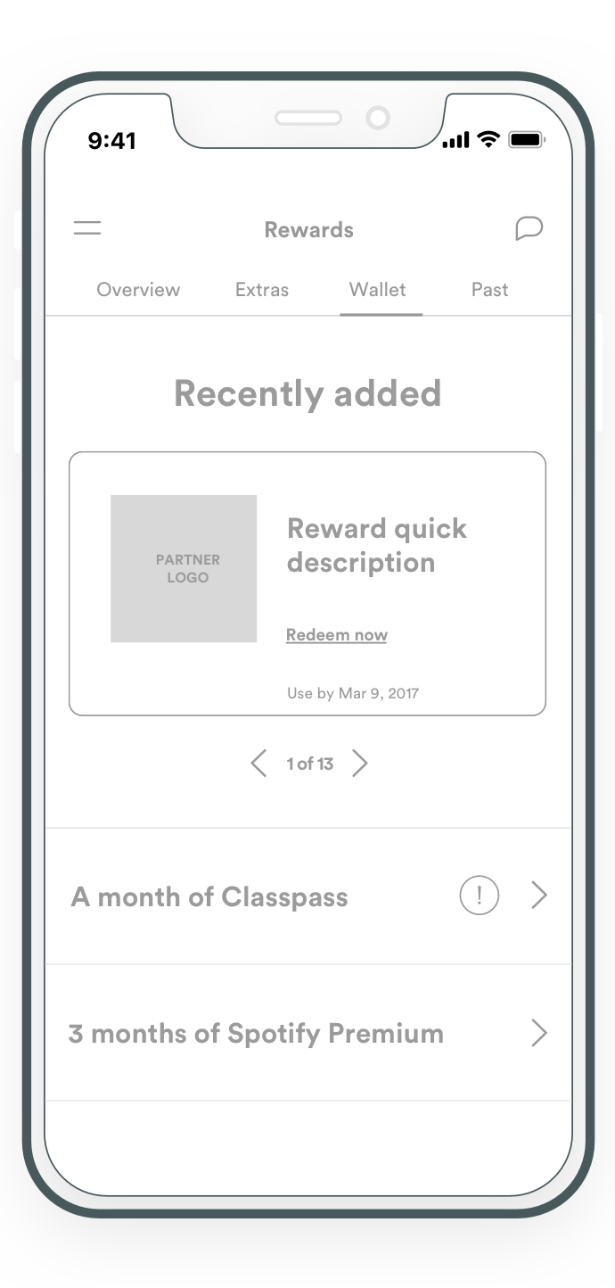
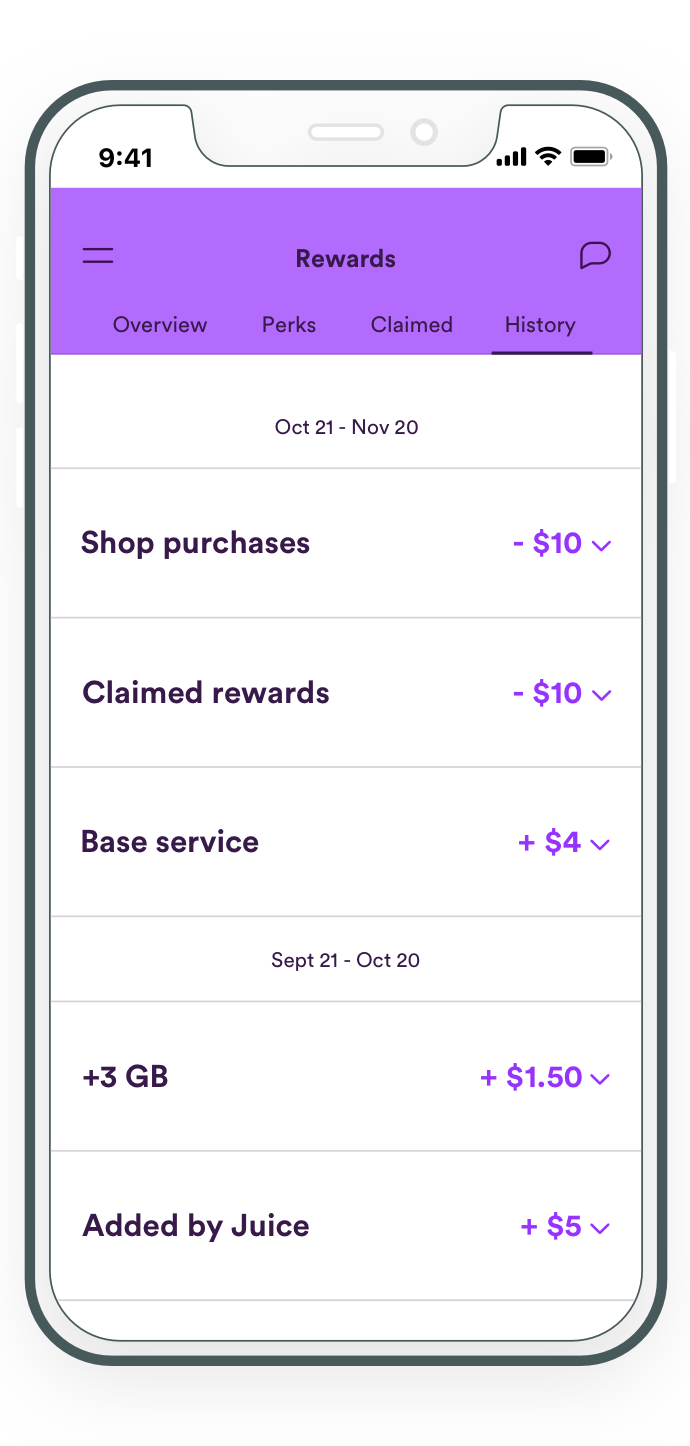
The Rewards have 4 core categories and functions:s
- View Juice credit balance.
- Browse rewards and offers.
- Use Juice credits.
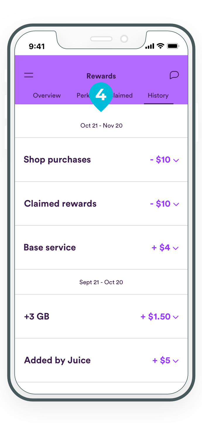
- Control activity history.
To represent a natural and seamless flow between categories as well as the rest of the app, we did over 10 iterations in each sprint.
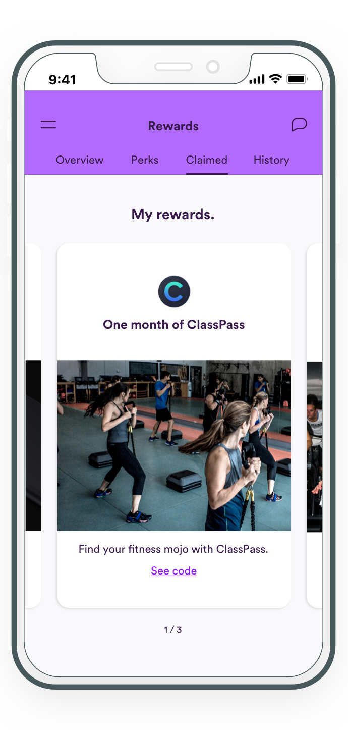
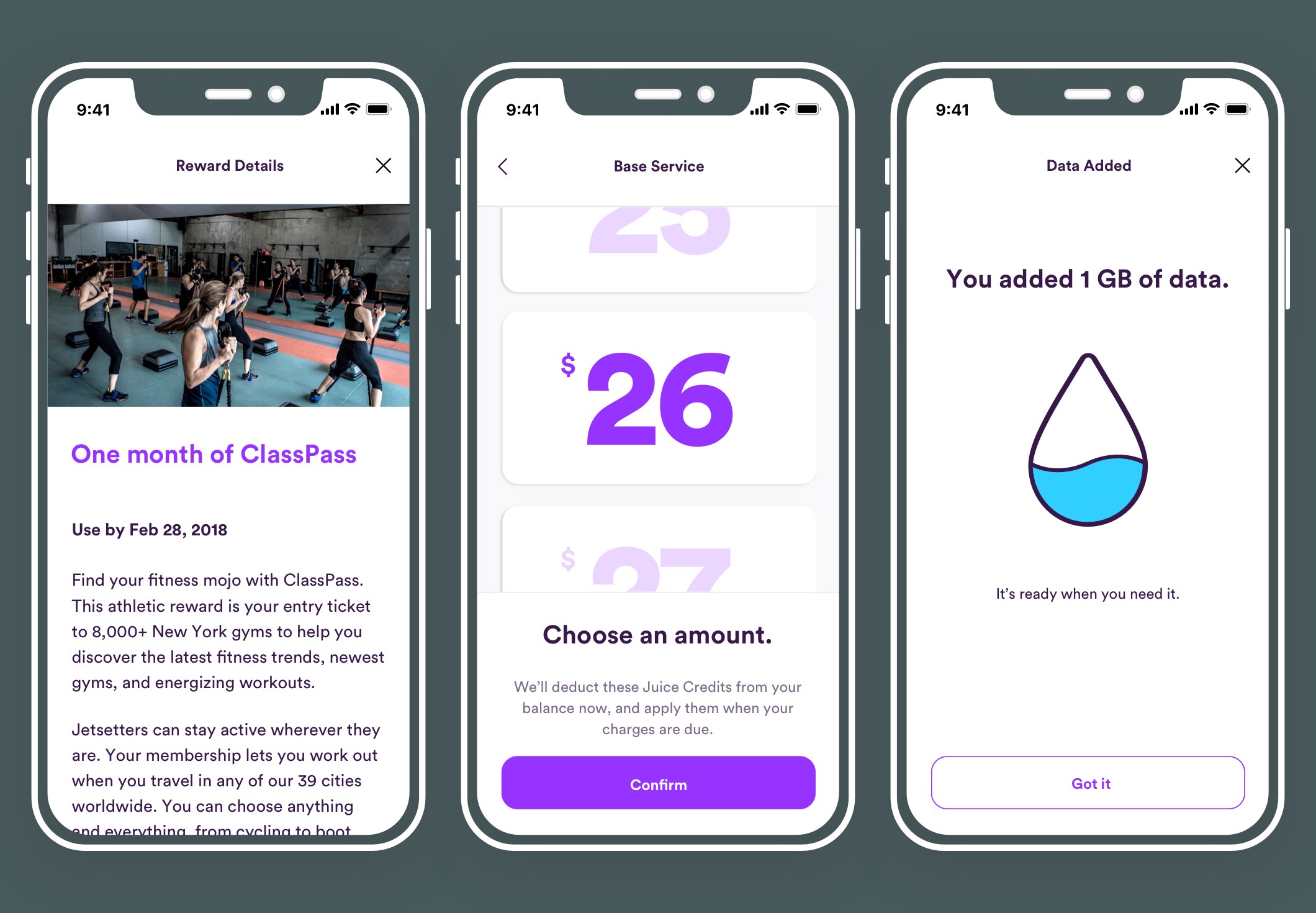
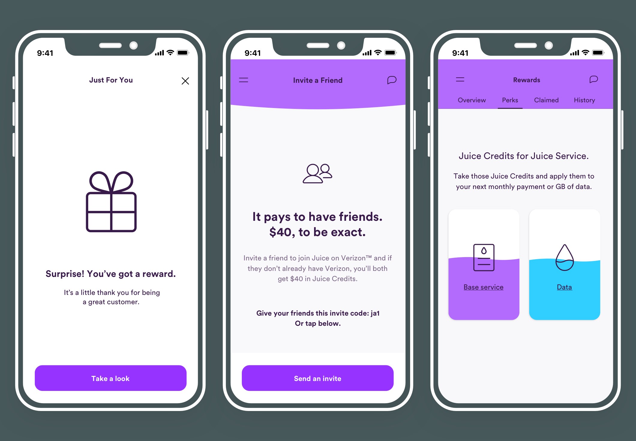
Here is an example of Viewing and claiming a surprise by Angela and Viewing and claiming a reward by Chris.
Site map
The architecture needed to be clear and simple for a minimum viable product. It needed to accommodate:
- The Verizon shop.
- My account.
- Data usage.
- Billing.
- Rewards.
- Community and Support.
Therefore, flexibility and sustainability was key to the architecture.
2. Ideation & Design
We had 4 weeks to deliver a list of features set by the product team.
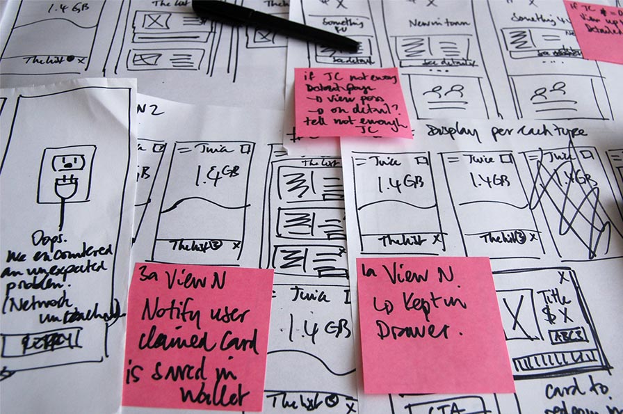
The first 2 weeks were dedicated to requirements gathering and first few rounds of sketching. The following 2 weeks included daily design iterations until we found the sweet spot.
We whiteboarded, sketched and continued iterating on Post-its during meetings, subway rides, waiting for coffee, you name it... we did it.
3. User Testing
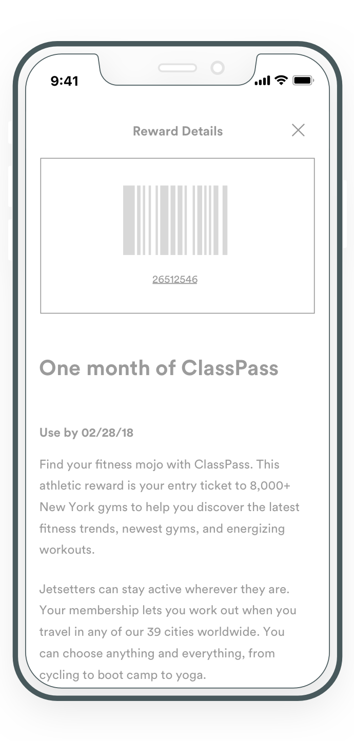
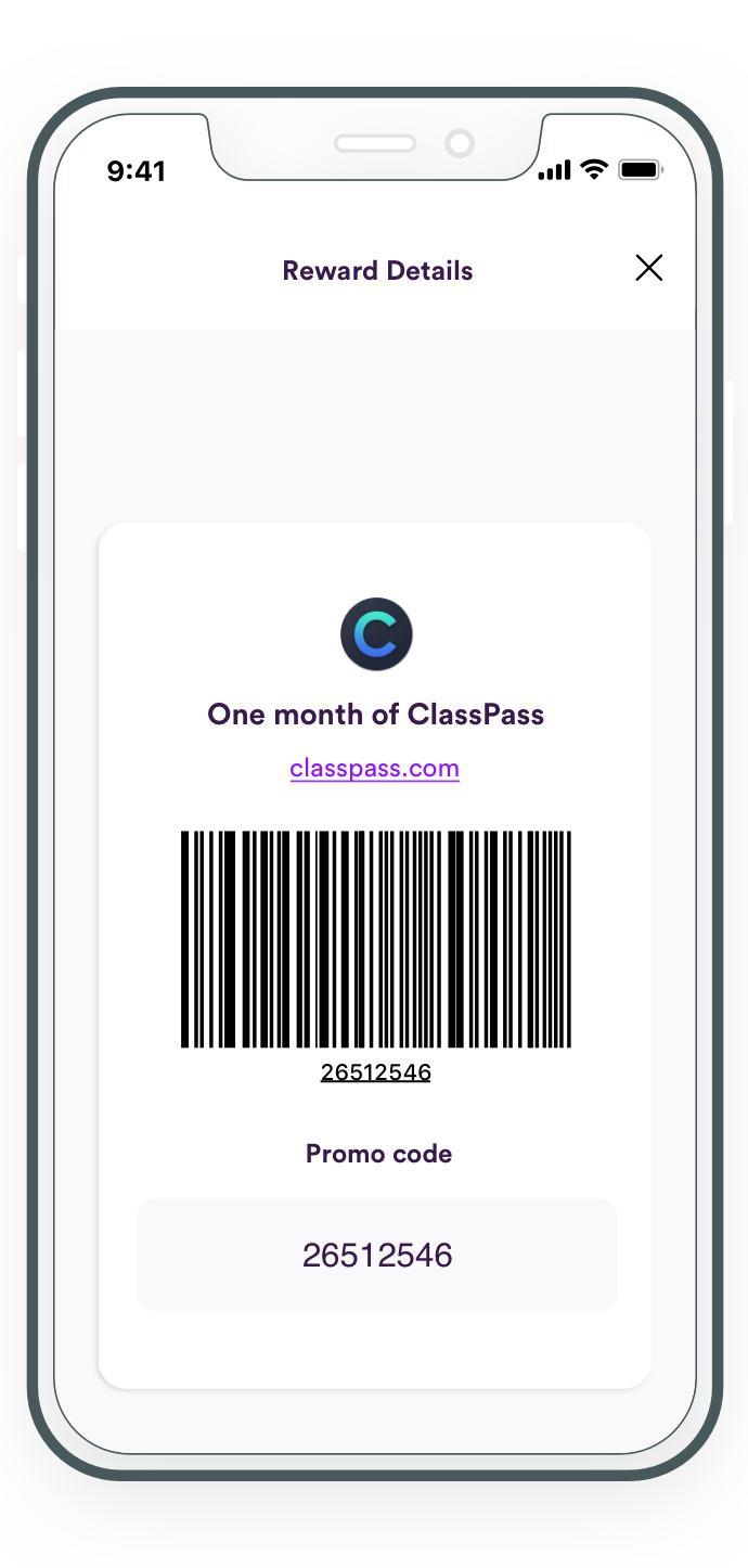
We created storyboards for test sessions, and put our designs in the hands of the test subjects to challenge or confirm our design decisions. The three core functions were to:
- View Juice credits balance.
- Use Juice credits.
- Verify Juice credits.
It made sense to have users performing the tasks in a similar manner:
The first set was to:
- View Juice credits balance.
- Browse and select a surprise.
- Verify Juice credits.
The second set was to look for:
- A reward code.
- Remove a reward used.
- Verify the transaction made.
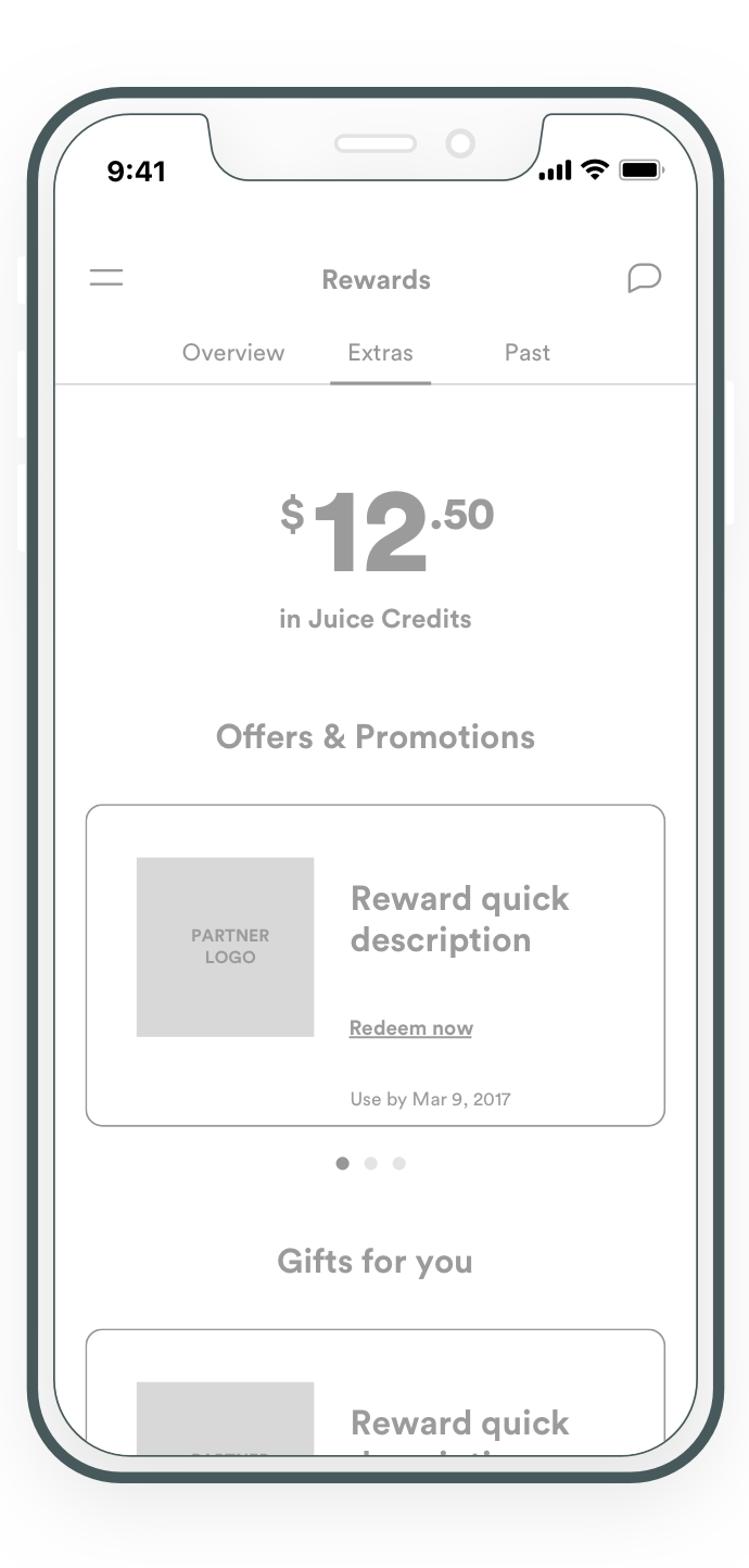
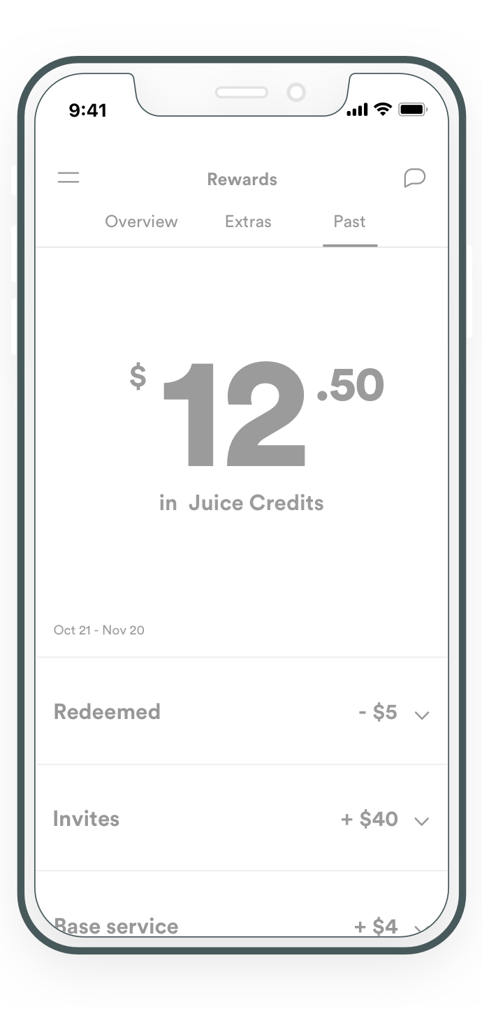
Key findings
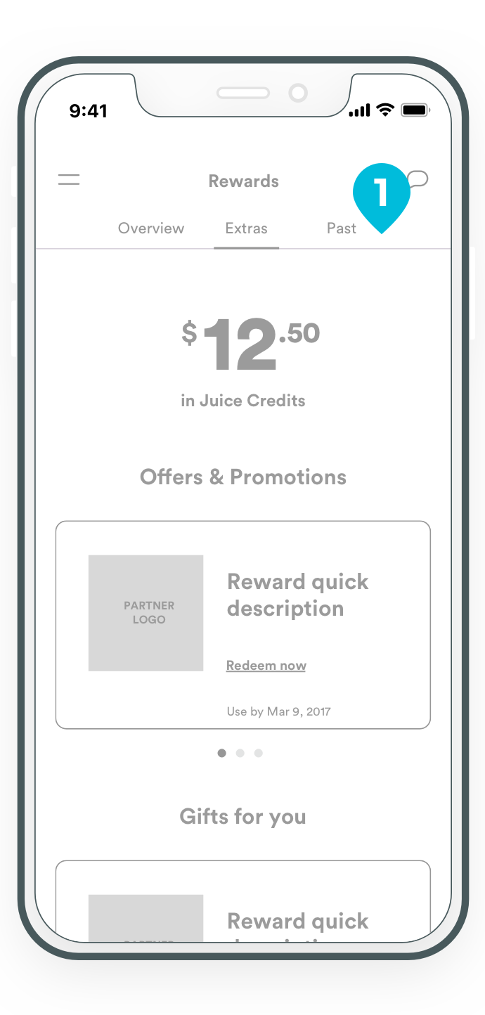
- The verbiage used for the tabs confused the users. They didn't understand the meaning of “Extras“ or “Past“.
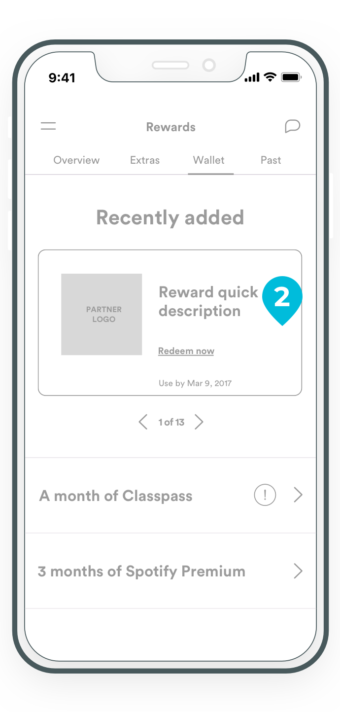
- The reward card had too many elements, which distracted from the main function: select the reward card to redeem.
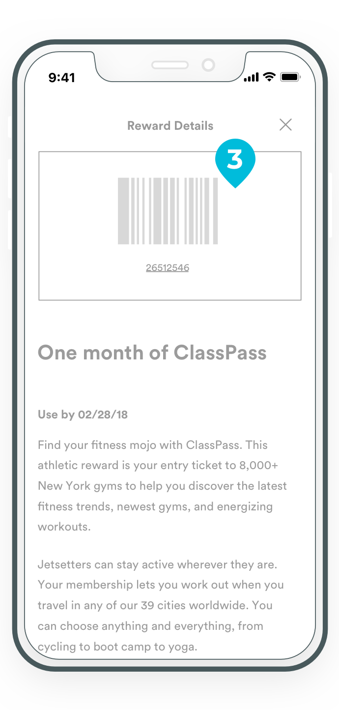
- Users felt the reward code was misplaced and confusing.
- Test subjects thought that viewing the Juice credits balance was misleading the transactions history.
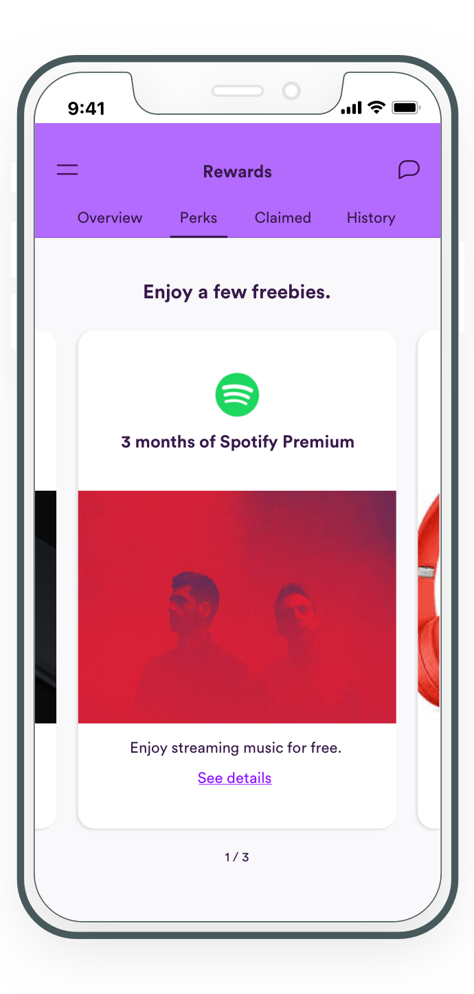
Design amends
We renamed the tabs and used verbiage that reduced cognitive load for the users.
We removed descriptive elements that were cluttering the card.
A space was dedicated for the reward code so users would not be distracted by the reward description.
We removed the Juice credits balance to keep the transactions history concise.
Solution
Outcome
The feedback from the internal stakeholders were very positive, some testers even wanted to use the app immediately.
While the experience was well received by leadership, the branding direction shifted from a multi-color design to a dual tone color scheme.
The tone and cheek tone of voice was tweaked to appeal to a wider generation.
Visible, the online-based phone plan launched in May 2018.